A booth can have the right team, the right product, and the right location, then still underperform because the branding materials were chosen in isolation. A practical event branding materials guide starts with one question: what needs to be seen from a distance, what needs to be handled up close, and what needs to survive setup, transport, and repeat use.
For business buyers, event organizers, and marketing teams, that question matters more than chasing a long list of display items. Most event problems are not caused by a lack of options. They come from mismatched formats, poor material choices, or graphics produced without considering lighting, venue rules, or installation time.
What this event branding materials guide should help you decide
The goal is not to buy every common event format. It is to build a set of branding materials that works together. That usually means combining structural displays, printed graphics, and small-format promotional pieces based on the event type.
A trade show booth needs visibility across an aisle, clear product messaging at eye level, and a setup that can be installed fast. A retail roadshow may need portable hardware, replaceable graphics, and materials that can handle repeated movement. A product launch often needs stronger visual finish, better lighting response, and tighter control over color and surface quality.
That is why event procurement works best when you treat branding materials as a system. Roll-up stands, popup displays, beach flags, counters, LED light frames, KT board stands, stickers, mounted boards, and printed handouts all have a job. The right mix depends on traffic flow, viewing distance, and how often the assets will be reused.
Start with the display role, not the product category
Buyers often begin with product names because that is how catalogs are organized. It is more useful to begin with function.
Entrance and long-range visibility usually belong to tall formats such as beach flags, light frames, large freestanding boards, or barricade displays. These formats help people locate the activation area before they can read smaller text. If the event space is crowded, height matters more than adding another tabletop sign.
Mid-range messaging is usually handled by popup displays, backdrops, framed graphics, or a well-placed roll-up stand. This is where your campaign line, product category, or event offer should sit. If your main visual is too small to read from a few steps away, the display is doing only half its job.
Close-range engagement is where counters, brochure holders, stickers, product cards, price signage, and mounted graphics come in. These pieces support sales conversations and product demos. They should not carry the entire burden of attracting traffic, because by the time someone is reading them, they have already decided to stop.
Choosing core event display formats
Roll-up stands remain one of the most practical options for events because they are portable, fast to install, and easy to swap between campaigns. They work well for side messaging, directional branding, registration areas, and secondary product visuals. They are less effective as the only visual anchor in a large exhibition space where more width and stronger structure may be needed.
Popup displays are a stronger choice when you need a branded backdrop with more visual presence. They give you a broader graphic area, which helps with brand blocks, product photography, and clean presentation for media walls or photo points. The trade-off is transport volume and a slightly more involved setup compared with a single roll-up unit.
Beach flags are useful outdoors, in mall atriums, and in roadshows where movement helps visibility. They are built for attention, not detailed reading. If your message requires multiple lines of text, a flag is the wrong format. If you need quick brand recognition from a distance, it is often the right one.
Counters are functional and visual at the same time. They give staff a working surface while extending the brand area. For sampling, registration, and lead capture, a branded counter often does more work than an extra standalone sign because it creates a natural interaction point.
LED light frames fit campaigns where image quality and illumination matter. They are effective for premium launches, cosmetics, fashion, property marketing, and indoor retail events. The print itself has to be prepared for backlit use. A standard graphic can look flat or uneven once lit, so the print method and media selection matter more here than with non-illuminated boards.
Print method affects more than image quality
The event branding materials guide often stops at hardware selection, but print production is where many performance differences show up.
Solvent and eco-solvent printing are common for signage and display graphics because they handle a wide range of media and are suitable for many promotional applications. Eco-solvent is often preferred when you want strong print quality with reduced odor for indoor use. For general event graphics, it is a practical baseline.
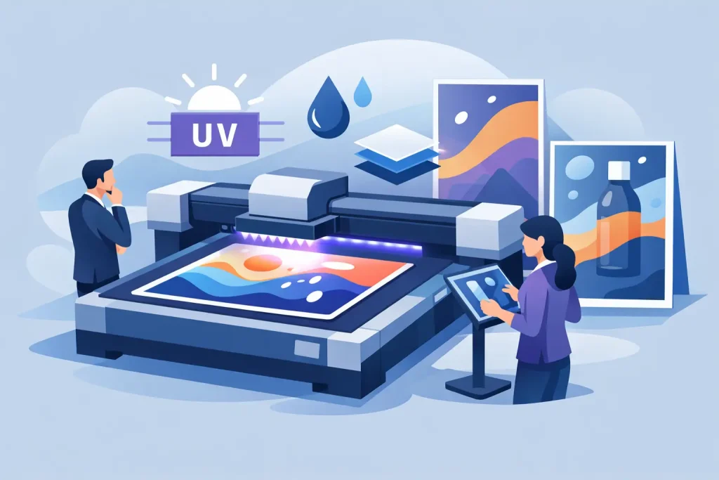
UV printing is useful when you need sharper output on rigid or specialty surfaces and want durability across varied conditions. It works well for boards, signage panels, and some applications that need stronger resistance to handling. If the display is likely to be touched, moved often, or used in mixed environments, UV can be a better fit.
Latex printing is a good option for high-quality indoor graphics where color consistency and environmental considerations are part of the brief. Dye sublimation is typically chosen for fabric applications, where you want a softer visual finish, lower glare, and easier transport. Fabric backdrops can be easier to fold and move, but they need the right frame system and graphic design approach to avoid weak presentation.
There is no single best method for every event. The right choice depends on substrate, finish, venue, and expected reuse. A low-cost print that has to be replaced after one event may not be cheaper than a more durable option used across multiple activations.
Substrate and finishing decisions that affect results
A good graphic file can still fail if the material is wrong for the use case. This is where procurement teams need to look beyond artwork approval.
PP white, synthetic media, Mirrorkote, hologram, transparent, and matt silver stickers all serve different campaign needs. PP white is widely used for clean visual output in general promotional graphics. Synthetic media is useful where moisture resistance or handling strength is needed. Mirrorkote can support a more polished printed finish for selected promotional items, while transparent and matt silver sticker stocks are often chosen for packaging-style branding, window application, or premium label effects.
Finishing also changes usability. Lamination can improve durability and reduce scuffing. Mounting affects flatness and presentation. A graphic that curls, reflects too much light, or scratches during transport can weaken the whole setup even if the design itself is correct.
KT board stands and mounted foam-type boards are useful for lightweight presentations, temporary indoor events, and promotional messaging where cost control matters. They are not always the best choice for repeated heavy transport. If an asset will be used across several cities or multiple weekends, stronger framing or more durable board construction may be worth the extra cost.
Match the material plan to the event environment
Venue conditions change what works. Indoor convention halls usually allow more control over print finish, lighting, and installation timing. Outdoor events raise different concerns such as wind, moisture, and viewing distance. Shopping mall activations often limit footprint while demanding strong visual impact from several angles.
If the event is moving across locations such as Kuala Lumpur, Johor Bahru, and Penang, portability becomes part of the buying decision. Reusable hardware with replaceable graphics usually gives better long-term value than one-off builds. For national campaigns, standardized dimensions also make reprints and replacements easier to manage.
This is where single-source supply has practical value. When display hardware, graphic output, mounting, and finishing are handled together, size compatibility and production coordination are easier to control. That matters when timelines are short and the event date will not move.
Common buying mistakes
The most common mistake is overloading small formats with too much information. Event graphics are read in layers. The top line should identify the brand or offer in seconds. Details can come later on counters, handouts, or one-to-one conversation.
Another mistake is choosing premium hardware with low-priority artwork, or the reverse. A strong frame will not rescue a weak print file, and excellent graphics can still look average on an unsuitable display format. Buyers need to evaluate the full combination.
The third mistake is ignoring reuse. If the event program runs quarterly, or if the same assets need to travel, replacement graphics and modular display systems are usually more efficient than rebuilding from scratch each time. My Inkjet is built around that type of product mix, where buyers can source standard hardware and matching print output without splitting the job across multiple vendors.
A useful way to close your planning is to ask whether each item has a clear role. If it does not improve visibility, guide traffic, support interaction, or carry a specific message, it is probably not needed. Better event branding usually comes from tighter selection, not more pieces.
Related Posts