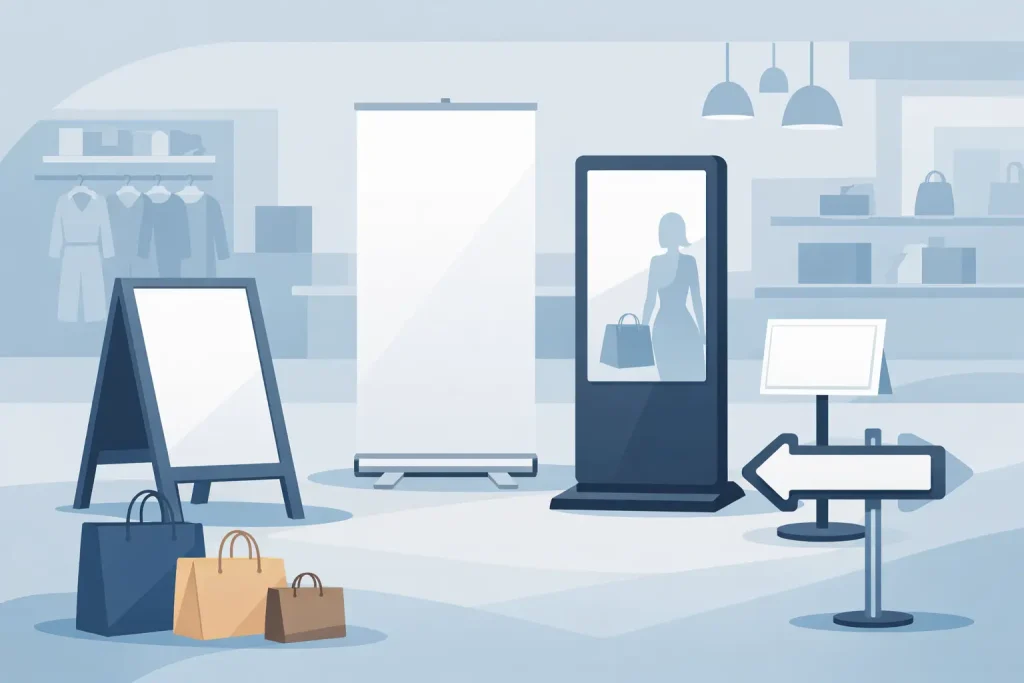
A crowded show floor exposes weak branding fast. If your stand looks busy, inconsistent, or hard to read from a distance, foot traffic drops before your team even starts talking. This exhibition booth branding guide focuses on practical decisions that affect visibility, message clarity, and print execution.
What good booth branding needs to do
Booth branding is not only about making a space look branded. It needs to do three jobs at the same time. First, it should help people identify your business within a few seconds. Second, it should tell visitors what you sell or what problem you solve. Third, it should support your staff by making the space easier to navigate and easier to use for conversation, demos, or lead capture.
That means design choices should be judged by function, not by whether they look impressive on a laptop screen. A wall graphic with too much copy may look complete in a presentation file, but on a show floor it often becomes background noise. A simpler layout with one clear headline, one strong product image, and consistent logo placement usually performs better.
Start the exhibition booth branding guide with the booth objective
Before selecting a popup display, roll-up stand, light frame, or counter, define the booth objective. The format should follow the use case. A product launch needs a different setup than a recruitment fair or a distributor event.
If the goal is visibility, prioritize height, bold contrast, and large-format graphics that can be read from the aisle. If the goal is product explanation, you may need a combination of backdrop graphics, printed boards, and counters that support samples or brochures. If the goal is lead generation, the branding should leave enough open space for staff interaction instead of filling every surface with graphics.
This is where many booths go off track. Buyers often choose display hardware first, then try to fit the message into it. The better sequence is objective, layout, hardware, then artwork production.
Build the message before the graphics
A booth should answer three basic questions without requiring a sales pitch. Who are you. What do you offer. Why should someone stop.
That message hierarchy matters more than decorative design. The brand name or logo should be visible but not oversized to the point that it consumes the only readable area. The core offer should sit higher in priority than secondary claims. Visitors scanning from five to ten meters away will not read a paragraph. They will notice a short statement, a product image, a color block, or a repeated shape.
A practical approach is to assign the booth into layers of information. Long-range visibility comes from your main backdrop, hanging element, flag, or illuminated frame. Mid-range communication comes from the headline and supporting visual. Close-range information can sit on counters, brochure holders, tabletop cards, or mounted boards. When every layer tries to say everything, nothing stands out.
Choosing the right display formats
Display format affects both branding impact and operating convenience. There is no single best setup. It depends on floor space, installation limits, transport requirements, and how often the graphics will be reused.
Roll-up stands work well for side messaging, directional information, and modular campaigns. They are efficient for smaller footprints and easy to redeploy across roadshows or retail activations. Popup displays create broader visual coverage and help frame the brand zone clearly, especially when the booth needs a defined backdrop without custom construction.
LED light frames are effective when the venue lighting is poor or when image quality needs to stand out in a premium category. They cost more than standard printed panels, but they improve graphic visibility and can make product visuals look sharper from a distance. Counters add function, but they should not block the entrance or become a storage point that weakens the visual front of the stand.
Beach flags and barricade displays are useful for event perimeters, queue zones, or outdoor promotions linked to the booth. KT board stands and framed graphics can support pricing boards, campaign visuals, or product education panels. For procurement teams, the real decision is whether the event requires portability, repeat use, quick installation, or a more rigid built environment. That affects hardware choice as much as branding does.
Color, contrast, and readability
Brand colors should be present, but not every brand palette works well in exhibition conditions. Some corporate colors look too flat under hall lighting. Others create low contrast when text is placed over them. Booth graphics need stronger readability than web graphics because the viewing distance is wider and the environment is visually noisy.
High contrast usually beats subtle design. Dark text on a light background, or the reverse, is easier to process quickly. Small reversed text on busy imagery usually fails. Fine lines, thin fonts, and light gray copy also tend to disappear.
It helps to test the artwork at actual scale. A headline that looks large on screen may feel small once printed on a three-meter backdrop. Product buyers often focus on file quality and resolution, which matters, but message size and contrast usually have more effect on booth performance.
Print method and material choice matter
An exhibition booth branding guide is incomplete without production planning. The same artwork can look different depending on print method, substrate, and finishing.
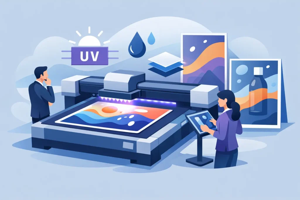
UV printing is often chosen for strong color output and material flexibility. Latex and eco-solvent options can suit display graphics where durability and image quality both matter. Dye sublimation works well for fabric-based displays, especially when you need lighter transport weight or a cleaner fitted appearance on textile systems.
Material selection should match the hardware and venue use. Fabric can reduce glare and pack down efficiently, but it handles imagery differently than rigid media. PP white, synthetic stock, sticker media, and mounted boards each have their place depending on whether the graphic is temporary, reusable, laminated, mounted, or installed onto a panel system.
Finishing also changes the result. Matte surfaces can reduce reflection under exhibition lighting. Gloss can add punch to some graphics but may create glare in busy halls. If the booth uses transparent, hologram, or metallic sticker elements, those should support the brand message rather than distract from it. Specialty media can help in retail-style displays or premium product showcases, but for many trade booths, standard clear messaging on reliable media performs better.
Keep the layout open and operational
Good booth branding is not only visual. It also needs to work with traffic flow. A stand that looks full may actually reduce engagement if visitors do not know where to enter or where to stand.
Counters, demo units, brochure racks, and storage should support movement instead of interrupting it. If a booth is narrow, large side panels may create a tunnel effect. If it is open on multiple sides, branding should be distributed so the message reads from more than one approach angle. Corner booths, inline booths, and island spaces need different graphic priorities.
Staff sightlines matter too. If front-facing displays block the team, visitors may hesitate to enter. In many cases, a cleaner front edge with branding shifted upward produces better results than covering every surface at eye level.
Consistency across printed assets
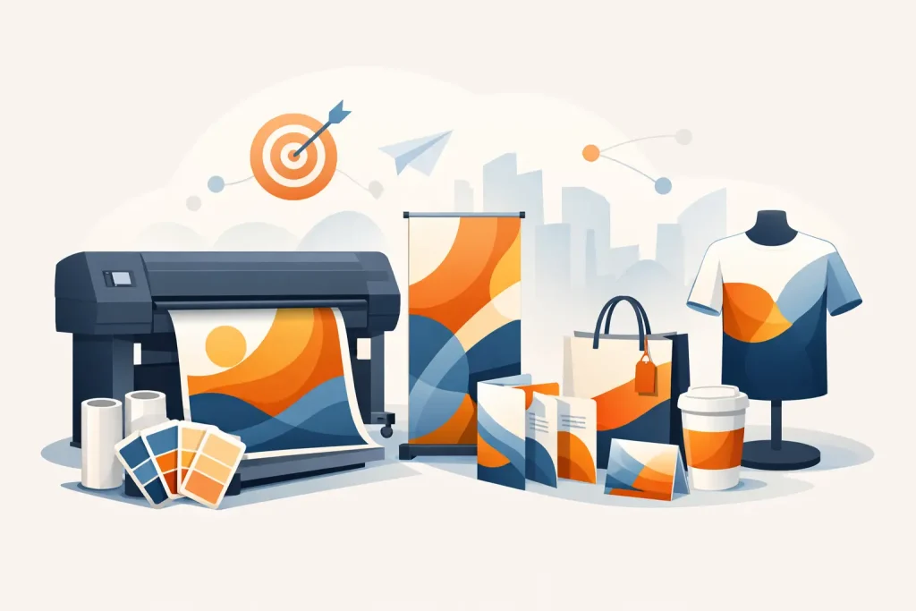
A booth rarely stands alone. Most exhibitors also need flyers, product sheets, stickers, branded counters, table wraps, and supporting signs. When these items are sourced separately, color mismatch and inconsistent artwork versions are common problems.
Using one supplier for display hardware and printed output can reduce those issues because sizes, fitting requirements, and production specs are managed together. For buyers handling events across Kuala Lumpur, Johor Bahru, or other Malaysian cities with repeated setups, consistency becomes even more important. Reordering a replacement panel or matching a previous campaign is easier when the display system and print production are aligned from the start.
Common booth branding mistakes
The most common problem is trying to say too much. Too many logos, too many claims, too many product photos, and too much body copy make the booth harder to scan. The second issue is poor scale control. Important text is often too small, while decorative elements get too much space.
Another frequent mistake is selecting materials based only on price. Lower-cost media can be suitable for short campaigns, but if the event schedule involves multiple setups, transport cycles, or premium presentation requirements, cheaper output may need replacement sooner. That changes the total cost.
There is also the issue of mismatch between hardware and graphic intent. A premium brand message printed on a basic structure can feel underbuilt. On the other hand, an expensive illuminated setup may be unnecessary for a straightforward B2B product display. The right answer depends on event type, audience expectations, and reuse plans.
Final checks before production
Before sending files to print, review the booth the way a visitor will see it. Check the headline at distance, verify logo placement, confirm product names, and make sure key messages are not hidden behind furniture or hardware edges. Confirm dimensions carefully, including bleed, viewing area, and panel joins.
It also helps to think beyond the first event. If the artwork may be reused in roadshows, retail promotions, or distributor meetings, design it with modular flexibility. A panel that works on a popup display today may later need to sit beside a roll-up stand or a counter wrap. Planning for that reuse can save time and production cost.
The best booth branding is usually the clearest, not the busiest. If your display tells the right story at a glance, uses the right format for the space, and is printed on materials suited to the job, your team has a much better chance of turning foot traffic into actual conversations.
Related Posts