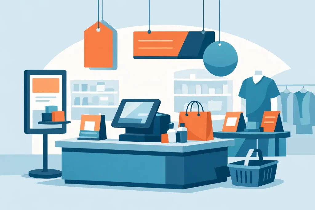
A discount sign taped to a shelf rarely does much on its own. A well-built retail point of sale display does more. It gives a product a physical presence, separates it from surrounding items, and turns a standard promotion into something shoppers actually notice at the moment they are ready to buy.
For retail operators, brand teams, and procurement buyers, that matters because in-store attention is limited. Most products are competing within a few feet of each other, often under mixed lighting and with little time to explain an offer. The display has to do practical work fast – stop the eye, present the message clearly, and hold up in a real retail environment.
What retail point of sale displays are designed to do
Retail point of sale displays sit close to the transaction area or at key selling zones where purchase decisions happen quickly. That can mean checkout counters, aisle ends, promotional islands, category hot spots, or product launch areas. The format may be small and temporary or larger and more structural, depending on campaign length and store layout.
The main job is not decoration. It is conversion support. A display should make the promotion easier to understand, help shoppers find the product without effort, and reinforce branding without getting in the way of the retail space. If the unit looks attractive but blocks access, tips over, or carries unreadable print, it is not doing its job.
This is why format selection matters as much as artwork. A countertop stand serves a different function from a roll-up stand. A hanging sign works differently from a freestanding board. A light frame creates a different visual effect than a foam board poster mounted near a shelf. Buyers usually get better results when they treat display hardware, graphic material, and print method as one package instead of three separate decisions.
Choosing the right retail point of sale displays
There is no single best format for all stores. The right choice depends on traffic flow, product type, campaign duration, and how often the graphics need to be replaced.
For short-term promotions, lightweight formats usually make more sense. KT board stands, printed boards, sticker applications, and compact counter displays are quick to deploy and cost-efficient for seasonal offers, price campaigns, and limited launches. They work well when the message has a short life and the store team needs simple installation.
For recurring campaigns or multi-location branding, reusable hardware is often the better buy. Roll-up stands, aluminum frames, wooden frames, pop-up structures, and LED light frames can stay in rotation while only the printed graphic changes. That reduces waste and gives marketing teams a more consistent presentation across branches.
For products placed in high-traffic zones, stability matters more than buyers sometimes expect. A display near a checkout lane or aisle corner will be bumped, moved, and cleaned around. In those cases, the cheapest unit may not be the lowest-cost option once replacement and maintenance are factored in.
Small format vs large format placement
Small-format point of sale displays are useful when the customer is already close to the product. Shelf talkers, counter cards, wobblers, small standees, and sticker-based graphics help close the sale with pricing, limited-time messaging, or a short benefit statement.
Large-format displays are better when the goal is visibility from a distance. Roll-up stands, popup displays, larger mounted boards, and barricade-style displays can direct traffic toward a promotion before the shopper reaches the category. These are especially useful for launches, themed zones, and temporary in-store events.
A common mistake is using a large display where a compact one would do, or forcing a small sign to carry a message that needs distance visibility. The format should match viewing distance first, then artwork style.
Print material and production affect performance
The same graphic can perform differently depending on substrate and print method. Buyers who focus only on artwork often miss that production choices affect glare, color density, durability, and installation speed.
PP white, synthetic stock, Mirrorkote, transparent media, hologram stickers, and matt silver stickers each solve different problems. A gloss-heavy finish may help a premium cosmetics promotion but create reflection under strong store lighting. A synthetic material may be better for areas where moisture, handling, or repeated cleaning is expected. Transparent stickers can work on glass or acrylic surfaces, but only if the surrounding light and background support legibility.
Print technology also matters. UV printing is useful when color strength and surface versatility are priorities. Latex and eco-solvent options may fit flexible graphic applications depending on substrate and indoor use. Dye sublimation makes sense for fabric-based display graphics where foldability and transport matter. The point is not that one method is always superior. It depends on where the display will be used, how long it needs to stay up, and whether the graphic is disposable or replaceable.
For retail buyers managing multiple display types, using one supplier for hardware and print usually simplifies the process. Fit issues, sizing mismatches, and production delays are less likely when the stand and graphic are planned together.
Design that works in a store, not just on a screen
Retail display artwork often gets approved on a monitor and then underperforms on the floor. The reason is simple: shoppers do not read in-store graphics the way marketing teams review digital layouts.
At point of sale, the message needs to be immediate. Product name, offer, price point, and one key selling point are usually enough. If the design tries to explain too much, it becomes background noise. Strong hierarchy matters more than clever copy.
Text size should match actual viewing distance. Contrast should match real lighting conditions. Product shots should be recognizable at a glance, not only when viewed close up. Brand colors need to print consistently across all pieces, especially if the campaign includes a mix of stickers, standees, frames, and banners.
That is also where finish and mounting choice can affect readability. A board with the right rigidity presents better than a curled print. A properly mounted panel looks more credible than a graphic that bubbles at the edge after two days. Execution changes perceived quality.
Temporary campaigns vs permanent retail use
A temporary campaign can be optimized for speed and cost. The display only needs to stay sharp for a defined period, so simpler materials and lighter hardware may be enough. This works well for holiday offers, price drops, bundle promotions, and event-based retail activity.
Permanent or semi-permanent retail use calls for a different approach. Repeated handling, cleaning, and long display periods require stronger hardware, better finishing, and graphics that will not fade or deform quickly. LED light frames, framed graphics, and more durable mounted panels are often better suited here.
The trade-off is budget versus lifespan. Paying more up front can make sense if the unit will be reused across multiple campaigns. For one-off promotions, that same investment may not be necessary.
Operational factors buyers should check before ordering
Procurement and marketing teams usually focus on dimensions, print count, and deadlines. Those are necessary, but a few practical details often decide whether deployment goes smoothly.
Ask how the unit will be packed, shipped, assembled, and updated. A display that looks efficient in a product image may take too long for store staff to install. If graphics will be changed regularly, replacement access should be simple. If the hardware will move between locations, weight and transport size matter.
Store conditions matter too. Flooring, aisle width, available wall space, power access for illuminated units, and housekeeping routines all affect performance. In dense retail environments, the best display is often the one that fits neatly, stays stable, and can be refreshed without specialist labor.
For multi-branch campaigns, consistency should be built into production. Matching color, cut size, and hardware format across locations is what makes a rollout look organized rather than improvised. That is particularly useful when serving retail networks, roadshows, and regional campaigns across cities such as Kuala Lumpur, Johor Bahru, and Penang, where deployment may happen in different store formats but still needs a unified presentation.
Why display sourcing often breaks down
Many retail campaigns run into trouble because hardware, print graphics, and finishing are sourced separately. One vendor supplies the frame, another prints the visual, and someone else handles mounting or stickers. That increases the chance of measurement errors, delays, or material mismatches.
A product-first supplier model is usually more efficient for point of sale work because the requirements are interconnected. The hardware size affects print setup. The print method affects substrate choice. The substrate affects mounting and finish. When these are handled together, buyers spend less time coordinating and more time managing the campaign itself.
My Inkjet fits that model by combining display hardware, large-format printing, and finishing options in one supply source. For business buyers, that is less about convenience as a slogan and more about reducing avoidable steps.
The best retail point of sale displays are not necessarily the biggest or most expensive units on the floor. They are the ones built for the actual selling condition, printed on the right material, and easy for store teams to use. If the display helps the product get noticed and keeps the message clear right where the decision happens, it is doing exactly what it should.
Related Posts