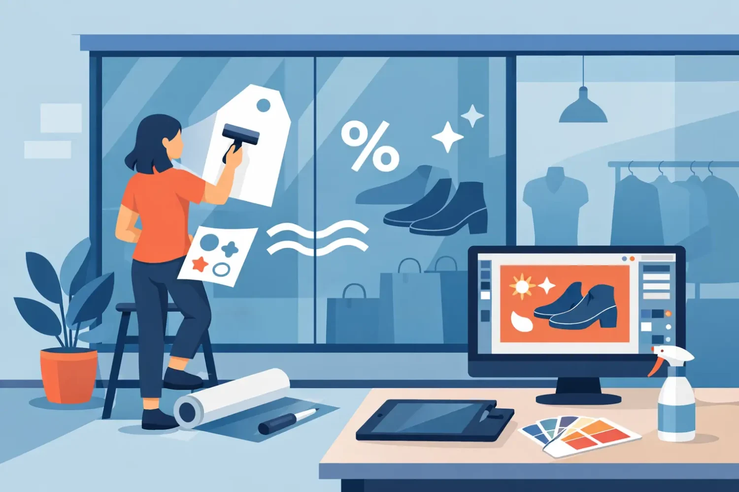
A retail window gets a few seconds to do its job. If the message is hard to read, crowded, or printed on the wrong material, the decal turns into background noise. That is why knowing how to design retail window decals matters just as much as choosing what offer or brand message to display.
For most stores, window decals need to do three things at once. They need to stop attention, communicate fast, and still work with the glass, lighting, and view into the store. Good decal design is not only about artwork. It is a mix of message hierarchy, sizing, material choice, print method, and installation planning.
How to design retail window decals with a clear objective
Start with the use case, not the software. A decal for a weekend sale is different from a decal for store hours, privacy, wayfinding, or permanent branding. If the purpose is short-term promotion, the design can be more direct and campaign-led. If the purpose is long-term branding, the graphic should be simpler and less date-specific.
This sounds basic, but many window decal files fail because they try to carry too many jobs at once. A storefront graphic that includes a logo, product list, social handles, opening hours, promo message, QR code, and decorative pattern usually underperforms. The viewer is moving. They will not process everything.
Set one primary action for each window zone. That action might be “notice the sale,” “recognize the brand,” or “understand what the store sells.” Once that is defined, the layout becomes easier to control.
Build the message for distance, not for the screen
Designing on a monitor can hide practical issues. Text that looks balanced at 100 percent zoom may be unreadable from the sidewalk or parking area. Window decals are viewed at different distances and angles, often with reflections, glare, and visual clutter from traffic.
The main line should be readable in one glance. Short wording works better than clever wording. “50% Off Selected Items” will usually perform better than a longer brand-style sentence. Supporting text should stay limited and should never compete with the main headline.
A simple hierarchy works best. Lead with the biggest message, follow with one supporting detail, then place brand identity or store information last. If everything is large, nothing is important.
Keep text short and readable
Use bold, clean typefaces. High-contrast combinations such as white on dark color, black on light color, or solid spot color against clear glass are generally safer than thin script fonts or low-contrast pastel combinations. Retail windows deal with sunlight, interior lighting, and reflections, so legibility usually matters more than style.
There is also a trade-off between elegance and visibility. Thin serif lettering may look premium for a boutique, but if the store is on a busy street, a heavier font may do a better job. The right choice depends on traffic speed, viewing distance, and brand position.
Match the decal layout to the window structure
Before finalizing artwork, check the actual glass dimensions and any physical interruptions. Mullions, handles, door frames, security sensors, and opening directions can all break a design if they are not accounted for early.
A common mistake is treating the storefront as one flat rectangle. In reality, many retail fronts have separate panes, entry doors, and partial obstructions. A graphic that spans multiple panels can work, but only if the artwork is planned to align with those breaks. If not, the message gets cut apart.
It is also worth deciding how much visibility into the store should remain. Full coverage creates strong impact and can add privacy, but it reduces natural view-through. Partial coverage keeps the storefront more open and can feel less heavy. This depends on the retail category. Fashion, beauty, and F&B often benefit from some interior visibility, while back-office areas or renovation periods may need more coverage.
Use the right coverage level
Small decals are useful for logos, hours, payment icons, or directional notices. Mid-size campaign decals work well for seasonal offers. Large-format window graphics are better when the storefront itself is the ad space. The right format depends on whether the glass is supporting the store experience or becoming the main promotional surface.
If you need branding plus a live view into the space, consider distributing graphics around eye level and lower sections rather than blocking the full pane. If privacy is part of the requirement, frosted or translucent treatments can do more than a standard opaque sticker.
Choose materials based on the job
Material choice affects appearance, durability, installation, and removal. This is where design decisions meet production reality.
Transparent stickers are useful when you want the glass to stay visually open and the printed areas to feel integrated with the storefront. They work well for logos, cut graphics, and minimal campaigns. White PP or synthetic sticker media gives stronger opacity and color presence, especially when the design needs solid areas and stronger contrast.
For decorative or premium effects, specialty media such as hologram, matt silver, or Mirrorkote can be useful, but only if the brand and message support that finish. These materials attract attention, but they can also reduce readability if overused. For most retail windows, clarity beats novelty.
If the artwork will be viewed from outside but applied inside the glass, reverse printing may be required. This protects the graphic from direct weather exposure and tampering, but it changes how files need to be prepared. That should be decided before production, not after design approval.
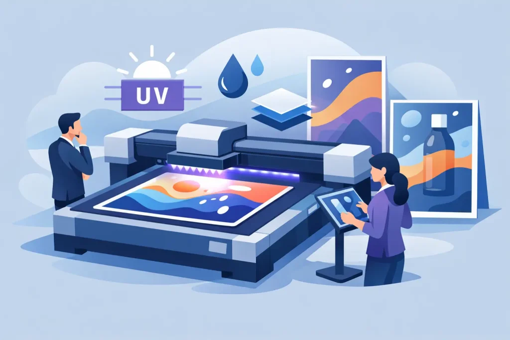
Print method affects the result
Solvent, eco-solvent, UV, latex, and other print methods each have practical differences in adhesion compatibility, finish, color handling, and intended environment. For window decals, the priority is usually a sharp image, stable color, and suitability for the selected media.
Large blocks of brand color, fine text, and photo-based promotion graphics may behave differently across substrates and print setups. If exact visual control matters, especially across multiple outlets, it is worth checking proofs or production guidance before full rollout.
Design for installation and maintenance
Good artwork can still fail during installation if the file ignores trimming, alignment, or application conditions. Add bleed where needed. Avoid placing critical text too close to the edge. If multiple panels are being installed side by side, plan overlaps and seam positions so they do not cut through key content.
Removability matters too. A short campaign should not become a costly cleanup job. If promotions change often, use materials and adhesive types suited to replacement cycles. Permanent branding can use more durable options, but campaign decals usually benefit from easier removal.
For stores with repeated promotions, it helps to standardize placement zones. Keep sale decals in one area, operational notices in another, and brand graphics in another. This avoids the common problem of old and new visuals fighting for the same glass.
How to design retail window decals for different retail goals
Not every storefront needs the same visual logic. A clearance event needs urgency. A premium brand launch needs restraint. A chain rollout needs repeatability across locations.
For promotional windows, lead with the offer. Price, percentage, and product category usually matter more than decorative elements. For brand-first windows, use fewer words and stronger composition. For service businesses, practical information such as hours, booking, and key services may deserve more space than imagery.
Multi-location retail adds another layer. A design that works in one branch may not fit another window size or street condition. Standardized systems help, but they should allow for minor adaptation. A high-traffic storefront in Kuala Lumpur may need bolder visibility than a quieter frontage in a smaller commercial strip.
Common mistakes that reduce performance
The most frequent issue is overcrowding. The second is weak contrast. The third is designing without checking the real storefront measurements. After that, problems usually come from poor material fit, too much fine detail, or trying to force one design to serve permanent branding and short-term promotion at the same time.
Another issue is forgetting inside-outside viewing conditions. Glass reflections change throughout the day. Interior lighting can wash out certain colors at night. What looks sharp in a flat mockup may disappear on actual glass.
Treat the storefront as part of the display system
Retail window decals work best when they are planned with the rest of the visual setup, not treated as an isolated print item. If the store is also using roll-up stands, counters, LED light frames, KT board stands, or other promotional displays inside the entrance, the decal should support that message rather than repeat it badly.
This is where a product-first supplier model helps. When decals, in-store display hardware, and print output are planned together, it is easier to keep color, messaging, materials, and campaign timing aligned. My Inkjet works in that practical space, where the format and the production method matter as much as the artwork itself.
The best retail window decal is rarely the busiest one. It is the one that fits the glass, prints cleanly, reads fast, and supports what the store needs that week or that season. If you design with the storefront conditions in mind from the start, the decal stops being decoration and starts doing real sales work.
Related Posts