A banner can look sharp on screen and still fail on press. The usual issues are basic: wrong size, missing bleed, low-resolution images, RGB files, or text sitting too close to the trim. If you need to know how to prepare print ready artwork for commercial output, the goal is simple – send a file that matches the final product, the print method, and the finishing.
That matters even more when the job is tied to hardware. A roll-up stand, popup display, LED light frame, sticker sheet, or KT board mount does not just need a good-looking design. It needs artwork built to exact dimensions, with safe margins and file settings that suit production. A clean file reduces delays, prevents rework, and gives the print team fewer reasons to stop and query the order.
How to prepare print ready artwork before you design
The first check is the product specification. Do not start with a generic canvas and plan to adjust it later. Artwork for a beach flag is not built like artwork for a poster, and a backlit LED light frame should not be treated the same way as a standard foam board print.
Start with the final size of the printed area. If the display hardware has a visible area and a hidden area, build for both. Roll-up stands are a common example. The bottom section often sits inside the base, so the graphic needs extra length that will never be seen from the front. If that hidden section is ignored, key content can disappear into the stand.
You also need to confirm whether the job requires bleed. Most trimmed print items do. Bleed is the extra image area extending beyond the cut line so you do not end up with white edges after trimming. For many print jobs, 0.125 inch bleed is standard, but large-format production can vary depending on finishing, cutter tolerance, and substrate. If exact bleed specs are available, use those instead of assumptions.
Resolution is the next decision. For close-viewed items such as brochures, counter cards, stickers, and smaller posters, 300 dpi at final size is a safe target. For large-format graphics viewed from farther away, lower effective resolution may still print well. A roadside banner and a trade show wall do not need the same pixel density. The trade-off is file size versus visible sharpness. Oversized files can slow production without improving the result.
Set up the file for the actual print process
Commercial artwork should usually be built in CMYK, not RGB. RGB is for screens. CMYK is for print. If you design in RGB and convert later, some colors will shift, especially bright blues, greens, and fluorescent-looking tones. Brand colors can also change if they are not managed properly.
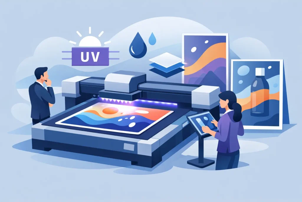
That does not mean every substrate and print method behaves the same way. UV, latex, eco-solvent, solvent, and dye sublimation can each produce color a little differently depending on the media. A fabric graphic printed by dye sublimation will not necessarily match a sticker printed on PP white or a backlit film for an LED frame. If color accuracy is critical, especially for retail chains or corporate brand systems, request a proof or align expectations before final output.
Black is another place where files go wrong. Small text should usually be 100% black only, because rich black mixes can cause registration issues in fine type. Large solid background areas often benefit from a rich black mix for better density. The exact build can vary by workflow, so consistency matters more than guessing.
Fonts need attention too. The safest approach is to outline them before export, or embed them properly if the workflow allows it. Missing fonts can reflow text, alter spacing, or substitute typefaces without warning. For event graphics and promotional displays, even a slight text shift can break alignment across panels.
Keep content inside the safe area
Trim line, bleed line, and safe area are different things. Many artwork problems happen because these are treated as the same boundary. The trim line is where the piece is cut. Bleed extends beyond it. The safe area sits inside it and protects logos, text, QR codes, and product shots from being cut too close.
A practical rule is to keep important content at least 0.125 to 0.25 inch inside the trim for smaller items, and more for larger-format products where finishing tolerance is broader. For banners with hemming and eyelets, safe area is even more important. Grommets can land through copy if the design is too tight to the edge. Pole pockets, folds, and stitch lines also need clearance.
This is where display format matters. A popup display may have panel joins. A frame graphic may sit under a border. A barricade display may lose edge detail once tensioned or mounted. Always design to the visible zone, not just the total print area.
Image quality and linked assets
A file can be the correct physical size and still print badly if the source images are weak. Pulling a logo from a website or stretching a social media image into a poster is one of the fastest ways to get soft output. Check effective resolution at final size, not just the original file dimensions.
Vector artwork is best for logos, icons, linework, and text-heavy graphics because it scales without losing clarity. Raster images are fine for photography, but they need enough resolution at the size they will actually print. If a product photo is central to the design, inspect it at 100% and again at final output scale.
Linked files should be embedded or packaged correctly before submission, depending on the software and workflow. Missing links can result in blank boxes, low-resolution previews, or substituted images. Flattening transparency can also help avoid output surprises in some production environments, especially when files move across different systems.
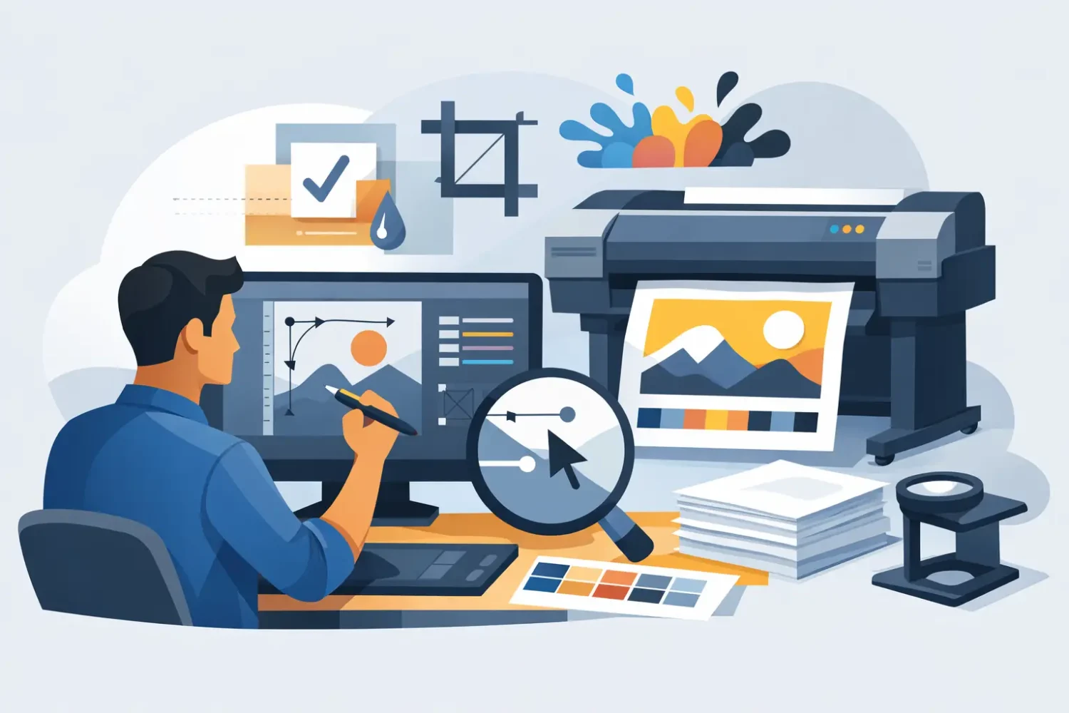
Export settings that usually work
PDF is the standard delivery format for most commercial print jobs because it preserves layout, fonts, and vector data better than editable source files. A press-ready PDF with bleed and crop marks is usually preferred, though not every large-format workflow needs marks. If the print provider asks for marks, include them. If the file is going into nested wide-format production, they may not be necessary.
When exporting, use high-quality compression settings. Do not downsample aggressively just to make the file smaller. Include bleed. Preserve overprint settings if used intentionally. If spot colors are required for branding, confirm whether the workflow supports them or whether everything will be converted to process color.
Naming the file clearly helps more than most buyers expect. Include the product, size, version, and final status. A file named “RollUp_33x79_v3_PRINT” is easier to process than “final-new-latest-2.” That matters when multiple SKUs, branches, or campaign versions are involved.
Common mistakes when preparing print ready artwork
The most common mistake is building the design at the wrong scale and forgetting to note it. If artwork is created at 10% scale, that must be stated clearly, and resolution has to be calculated accordingly. Another frequent issue is leaving hairline borders around the edge of the design. Even minor trim movement can make borders look uneven.
Transparent backgrounds can also cause confusion if the final expectation is a white print surface. On clear stickers or transparent media, what looks fine on screen may print very differently depending on white ink setup and substrate. The same applies to metallic or specialty sticker materials such as matt silver, hologram, or synthetic stocks. Design choices should match the material behavior.
Overprints, hidden layers, and unused dielines are other regular problems. Before sending the file, turn on separations preview if available, remove stray objects, and confirm that all non-printing guides are either deleted or placed on clearly named layers.
A practical preflight before submission
Before you upload or send artwork, stop and check the file as if you were the print operator. Confirm final dimensions, bleed, safe area, color mode, image resolution, font handling, and export format. Then check product-specific details such as hemming allowance, pocket direction, panel splits, stand base insertion, or frame overlap.
For businesses ordering across multiple locations like Kuala Lumpur, Johor Bahru, or Penang for the same campaign, consistency matters as much as accuracy. One approved master file with controlled versioning avoids mismatched output between branches, event sites, or retail stores.
If the project includes both hardware and graphics, keep the specification sheet with the artwork file. That reduces confusion between visible size and total print size and helps the job move faster through production. For buyers managing repeated orders, this becomes part of the standard workflow.
My Inkjet works with a broad mix of display formats, print methods, and material types, so the cleanest jobs usually come from buyers who match the file setup to the end use instead of treating every item like a poster.
Good artwork preparation is not about making the file look technical. It is about making sure the printed result fits the product, installs correctly, and looks right the first time.
Related Posts