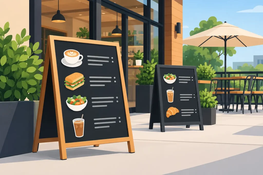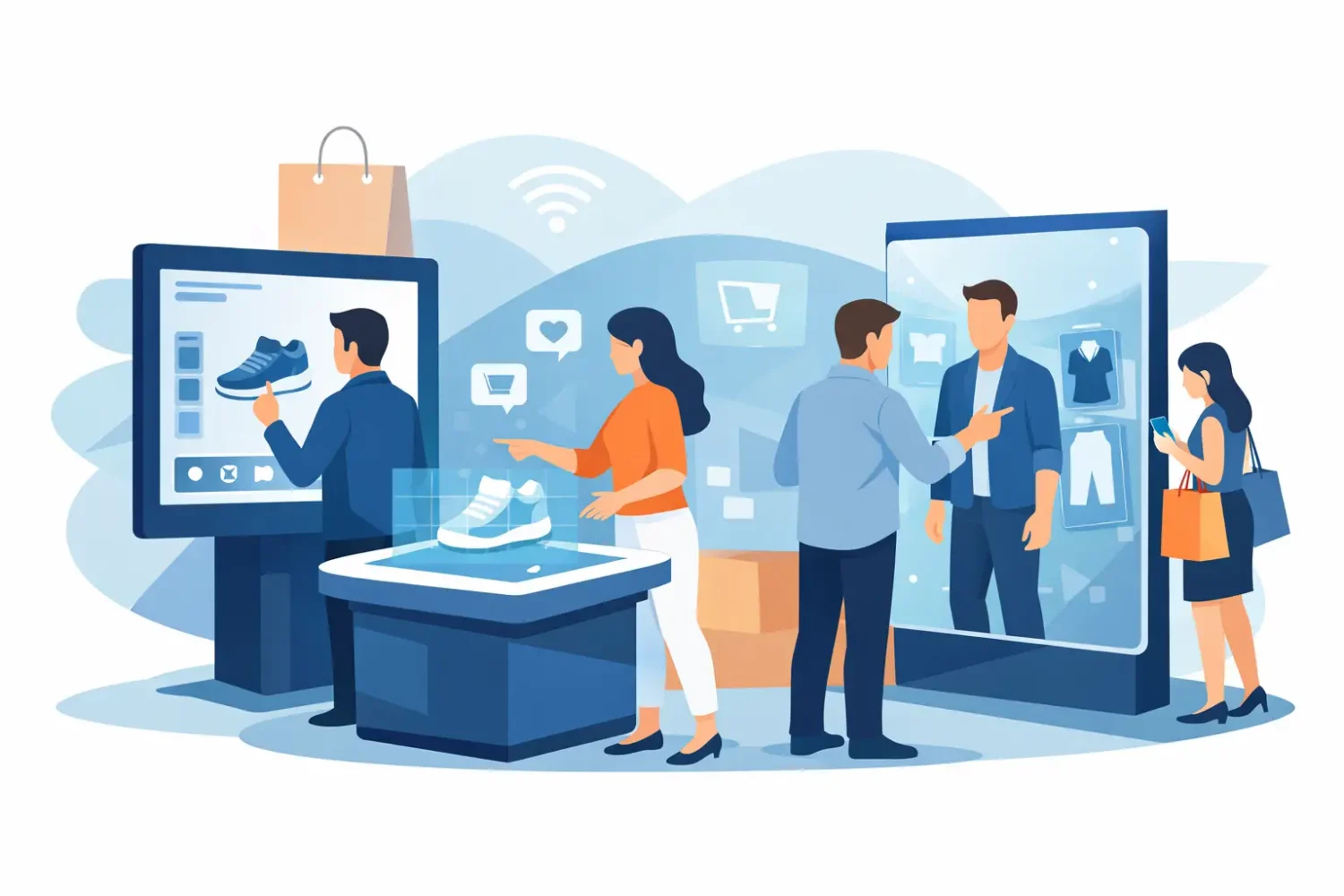
A shopper stops at an endcap, compares two products, scans a QR code for a size guide, and leaves with the item that answered a question fastest. That is the job of interactive retail displays: not simply to look good, but to move a customer from notice to action. The interaction may happen on a touchscreen, through a mobile scan, with a product sample, or at a staffed counter. The display system still has to do the basic work first – make the offer visible, readable, and easy to trust.
For retail operators and marketing teams, the practical question is not whether to add technology everywhere. It is where interaction removes friction from a purchase decision. A simple printed stand with a clear call to scan can be more useful than an expensive screen with content nobody maintains.
What Makes a Retail Display Interactive?
An interactive display asks the shopper to do something and gives a useful response. Tapping a screen, scanning a code, lifting a sample product, selecting a color swatch, entering a contest, or asking staff for a demonstration all count. The customer should receive product information, a benefit, a reward, or a clear next step.
This distinction matters because many retail displays are promotional but not interactive. A PVC roll-up stand that announces a sale is a static message. The same stand becomes interactive when it includes a QR code that opens stock availability, a product comparison, a coupon, or a registration form. The hardware does not need to be complicated. The response has to be immediate and relevant.
For high-traffic promotions, a digital kiosk or tablet can handle product browsing, quizzes, membership sign-ups, and guided recommendations. For shorter campaigns, printed graphics paired with QR codes are often easier to install, replace, and scale across several stores. The right format depends on the campaign objective, store environment, and available staff support.
Start With the Customer Action
Before choosing a light frame, counter, popup display, or screen, define the one action that matters. Trying to collect leads, explain five product categories, launch a loyalty program, and promote a discount from one display usually produces a crowded message and low response.
A beauty brand may need customers to identify a skin concern before seeing recommended products. A consumer electronics retailer may need to help shoppers compare specifications. A food or beverage promoter may want sampling sign-ups or a limited-time redemption. Each situation needs different content, space, and interaction time.
Keep the first instruction short. “Scan for your size,” “Find your match,” “Compare models,” or “Tap to see colors” is clearer than a paragraph about campaign features. Customers decide within seconds whether the display is worth their attention. If the action takes more than a few moments, show a visible benefit before asking for personal details.
Use a simple interaction path
The strongest display journeys have three parts: attract attention, state the action, and show the payoff. A bright visual can stop traffic. A headline tells people what to do. The result, such as a voucher, recommendation, sample, or product detail, makes the effort worthwhile.
Avoid sending shoppers to a generic homepage or a dense PDF after a QR scan. The mobile destination should continue the message shown on the display and work properly on a phone. If a customer scans a “Compare models” code, the first screen should be a comparison, not a navigation menu.
Match the Hardware to the Store Environment
Interactive retail displays are only effective when the physical setup works in the actual selling area. A premium product zone may support LED light frames, framed graphics, or a countertop tablet. A supermarket aisle needs a compact format that does not block products, customer flow, or cleaning access. A roadshow needs portable hardware that can be assembled quickly and transported repeatedly.
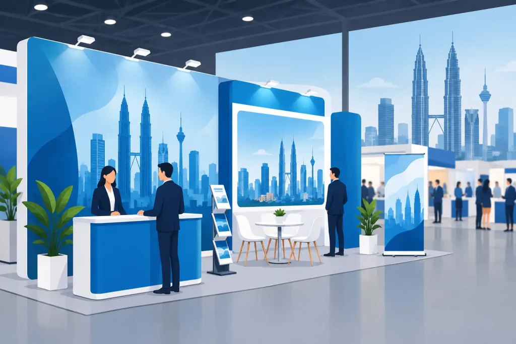
Roll-up stands are useful for entrances, promotional aisles, and temporary activations because the graphics can carry a direct QR-led message and the unit is easy to relocate. Popup displays provide a larger branded backdrop for demonstrations, product launches, and retail events. Counters create a natural interaction point for sampling, registration, and assisted sales conversations.
For window-facing campaigns or areas with lower ambient light, LED light frames give graphics stronger visibility. They work well for product launches, seasonal collections, and brand-led visual merchandising. However, lighting alone does not create interaction. The call to action must remain readable at normal walking distance, and any QR code should be placed where a customer can comfortably scan it without stopping traffic.
Freestanding KT board stands, aluminum frames, and wooden frames can suit directional signage, product education, and price-led promotions. They are generally simpler than digital hardware, but that is often an advantage when the campaign changes frequently. Replaceable printed panels allow a retailer to update offers without replacing the full structure.
Design the Print and Screen Content for Fast Decisions
Retail content is viewed while people are moving, carrying items, talking, or comparing products. Large type, strong contrast, and limited copy are operational requirements, not just design preferences. The main headline should be understood from a distance. Supporting details can sit closer to the interaction point.
Printed graphics and digital content should use the same product names, colors, and offer terms. A disconnect creates hesitation. If the printed panel says “20% off selected items” but the landing page uses different conditions or product images, customers may assume the promotion is unclear or expired.
QR codes need adequate quiet space around them and enough physical size for the expected scanning distance. Test them under the store lighting and from the angle customers will approach. A code placed too low, behind a reflective surface, or next to excessive visual detail can reduce scans even when it is technically functional.
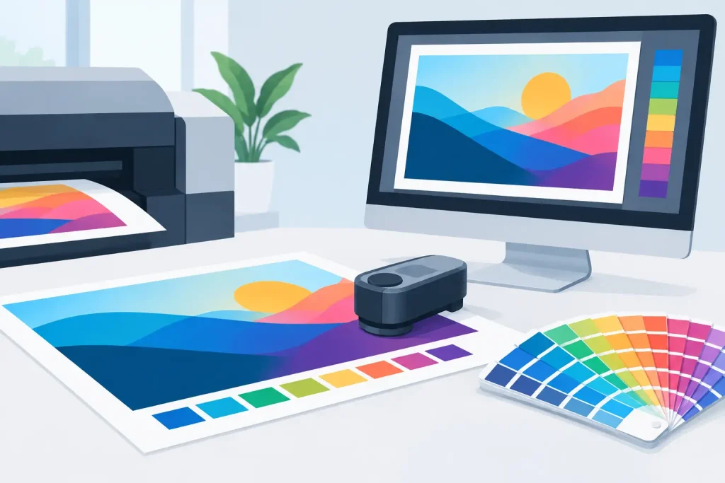
Material choice also affects performance. PP white, synthetic stickers, transparent stickers, and matt silver labels each create a different finish and suit different surfaces. Transparent graphics can work on glass, but the message needs sufficient contrast against the view behind it. Hologram material may attract attention for limited editions or security-led promotions, but it can make fine text harder to read. For busy retail use, durability, clean adhesion, and color consistency often matter more than novelty.
Choose Print Production for the Job
A display project should be specified around viewing distance, indoor or outdoor use, campaign duration, substrate, and finishing requirements. These choices affect both visual quality and replacement cost.
UV printing is suitable when a job needs strong color output on selected rigid or specialty materials. Latex and eco-solvent printing are practical options for many display graphics, including banners, films, and mounted applications. Dye sublimation is commonly used where fabric output and a softer textile finish are required. There is no single best method for every retail campaign. A one-week product launch inside a mall has different material needs from a long-running storefront graphic or a traveling promotional roadshow.
Finishing is equally important. Lamination can improve resistance to handling and cleaning. Proper mounting keeps panels flat and professional. Cut stickers need a clean edge and correct application method, especially on glass, counters, or curved surfaces. When display hardware and print output are ordered together, sizing, mounting points, and graphic replacement are easier to coordinate.
Plan for Maintenance Before Launch
Digital interaction adds content and hardware responsibilities. Screens require power, network access where relevant, safe cable management, regular cleaning, and a plan for software or content issues. A frozen tablet beside a polished retail display damages credibility quickly.
Printed interaction also needs maintenance. Check that QR codes lead to the correct campaign page, promotional dates remain current, and stickers have not lifted at corners. Staff should know the offer well enough to help customers who ask what happens after they scan or register.
For multi-location programs, use standardized artwork, hardware sizes, installation instructions, and replacement schedules. This reduces variation between stores and helps procurement teams reorder the same format when a campaign is extended. My Inkjet can support this kind of requirement by supplying both display structures and printed graphic output through one production source.
Measure More Than Foot Traffic
A display in a busy location may receive many glances and few useful interactions. Track the measures tied to the original customer action: scans, completed forms, coupon redemptions, product comparisons, sample requests, assisted demonstrations, or sales of the promoted SKU.
Compare results by location, time period, display format, and message. A QR-led stand near a fitting room may outperform a larger entrance display because customers have a more immediate need for size or product information. Conversely, a large LED frame may be better for generating awareness of a new range before shoppers reach the product area.
Do not judge the display only by digital engagement. Staff feedback can reveal that shoppers are asking better questions, finding items faster, or spending less time deciding between options. Those are useful signs that the interaction is reducing friction even when the final purchase is completed later.
The best next step is usually a focused pilot: choose one product question, one display format, one customer action, and one way to measure the response. Once the message and placement prove themselves, expanding the hardware and print program becomes a practical retail decision rather than a costly experiment.
Related Posts