A blue logo that shifts purple on a PVC roll-up stand, a skin tone that prints too red on a light frame graphic, or a campaign color that changes between stickers and fabric can weaken an otherwise finished display. This commercial print color matching guide covers the decisions that control color before production starts: artwork setup, print method, substrate, proof approval, and viewing conditions.
Commercial color matching is not a promise that every material will reproduce the same color in the same way. It is a controlled process for getting the closest practical result on the selected product. A UV print on KT board, a latex print on vinyl, and dye sublimation on polyester fabric each use different ink, surface, and curing processes. The target is consistency within the limits of the material and production method.
Start With the Correct Color Mode
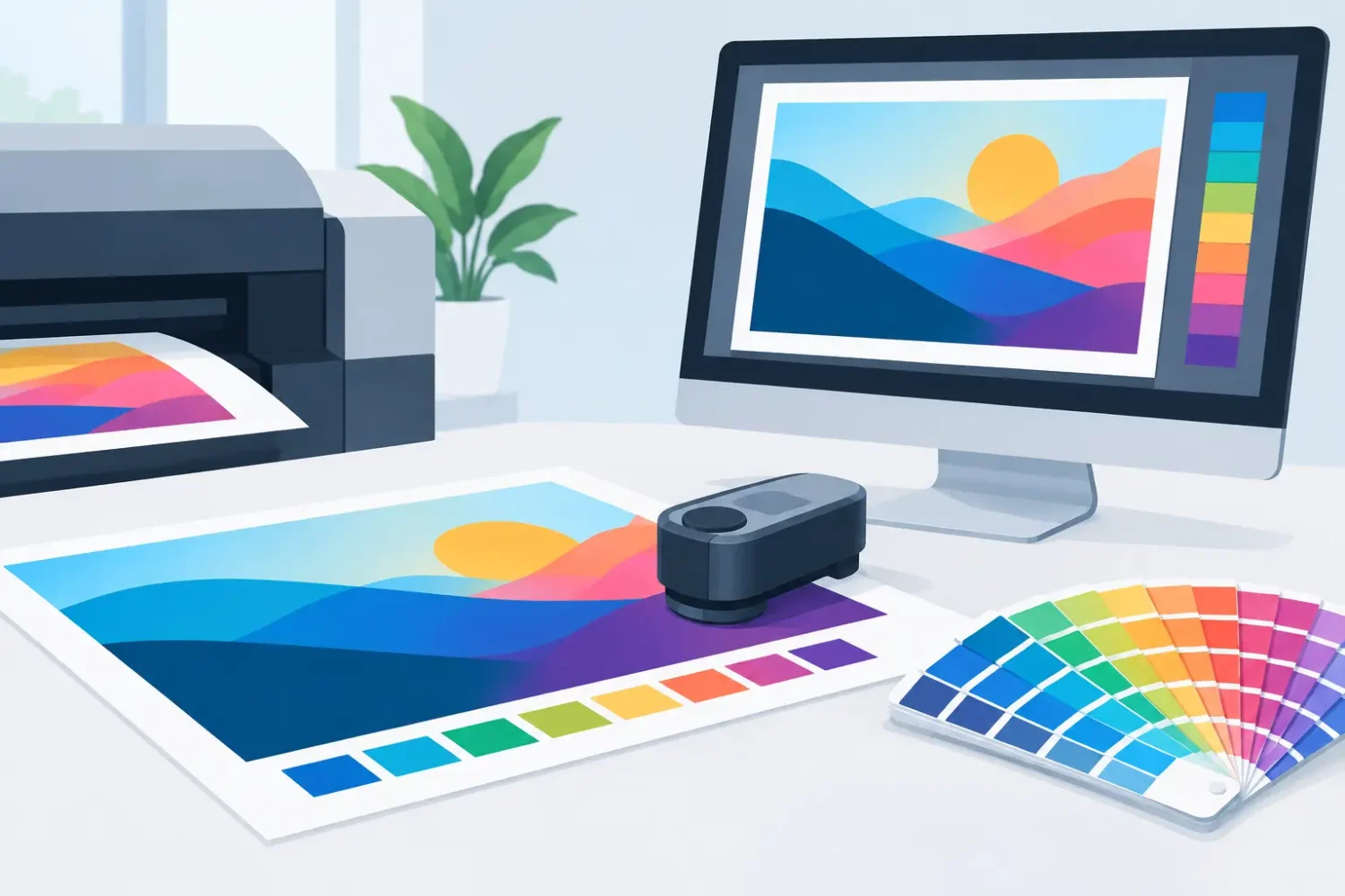
Most brand artwork begins on a screen. Screens use RGB light, while commercial printers commonly use CMYK inks. RGB has a wider visible range, especially in bright greens, blues, and fluorescent colors. When an RGB file is converted for print, some colors must shift because CMYK cannot reproduce every screen color.
Supply print-ready artwork in CMYK whenever possible. This gives the designer control over how key colors convert instead of leaving a late-stage conversion to the output workflow. For large-format graphics, use the CMYK profile specified for the job when one is available. A profile built for coated paper is not automatically suitable for self-adhesive vinyl, fabric, canvas, or backlit film.
Do not judge a CMYK file only by how it appears on an uncalibrated laptop or phone. Screen brightness, night mode, browser settings, and display calibration can all alter the apparent color. A monitor is useful for layout approval, but it is not a physical color standard.
Use Spot Colors for Critical Brand Colors
If a logo, corporate orange, or signature red must remain recognizable across campaign materials, identify it with a Pantone spot color reference or approved CMYK build. A spot-color reference tells the print team which brand target matters, even when the final output uses process inks.
That reference does not mean the printer can reproduce the exact Pantone ink appearance on every substrate. A glossy white sticker may come close, while uncoated fabric or transparent film may look different. It does, however, create a clear target for conversion, proofing, and approval.
For black text and fine line work, use 100% K black rather than a four-color rich black. Registration variation in large-format printing can make rich black small text appear soft or fringed. Use rich black for large, solid background areas only when the production specification supports it.
Build the File for the Actual Display Product
Color is affected by more than ink values. The display format changes how the finished graphic is viewed. A roll-up stand graphic is usually seen under mixed indoor lighting. A beach flag may be viewed in direct sun. An LED light frame pushes light through the graphic, making colors appear brighter and sometimes less dense than the same file on a front-lit board.
Specify the final product at the artwork stage. State whether the graphic is for a PVC roll-up, popup display, fabric backdrop, LED light frame, window sticker, PP white print, Mirrorkote, or mounted board. This allows the production team to apply the right media profile and finishing allowance.
Use the supplied template for display hardware whenever one is available. Roll-up stands require bottom bleed for the cassette, popup panels require correct panel divisions, and fabric systems may need sewing or silicone-edge allowances. Do not place color-critical logos, product labels, or small text inside trim and hardware zones.
Image resolution also affects perceived color. A low-resolution image may not only look soft – compression artifacts can create uneven gradients, blocky shadows, and dirty-looking solid areas. For large-format work, resolution should be assessed at final viewing distance. A retail wall graphic viewed from several feet away does not require the same pixel density as a countertop sign viewed at arm’s length.
Material Changes the Result
The same CMYK values can look noticeably different across materials. This is normal. The whiteness, texture, gloss level, opacity, and surface coating of the substrate all influence the final result.
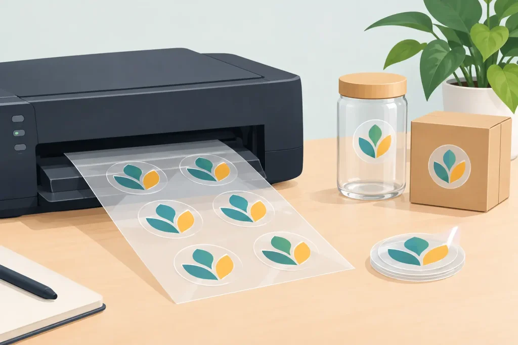
Glossy vinyl and coated sticker stocks generally produce stronger contrast and deeper-looking color. Matte vinyl reduces glare and can make images feel softer. PP white provides an opaque white base, while transparent sticker depends heavily on the color and light behind it. Matt silver and hologram materials reflect their base surface through unprinted or lightly printed areas, so standard artwork often needs adjustment.
Fabric has its own behavior. Dye sublimation bonds ink into polyester fibers, producing durable and flexible graphics for flags, tension fabric displays, and backdrops. The finish is often less glossy than vinyl, and the fabric weave can soften fine details. Solvent, eco-solvent, UV, and latex printing also differ in ink laydown and surface appearance. There is no universal “best” method. The right choice depends on the display material, indoor or outdoor use, handling requirements, and expected viewing distance.
Backlit graphics need separate attention. A file that looks correct on screen or on front-lit vinyl may appear pale once light passes through it. Backlit film may require a denser ink build or a dedicated backlit color adjustment. If the campaign includes both standard signage and LED light frames, approve the color separately for each application.
Proof Before Full Production
For color-sensitive jobs, a physical proof is the most useful approval step. A printed proof shows what a PDF cannot: the interaction between ink and the actual media. It is particularly valuable for brand colors, product packaging images, cosmetic shades, food photography, skin tones, and large solid backgrounds.
Ask for a proof on the intended substrate and, where possible, using the intended print method. A proof on paper is useful for content and layout, but it is not a final color reference for a UV-printed board or a dye-sublimated fabric wall.
Review proofs under the lighting where the display will be used. Retail LEDs, daylight, warm event lighting, and office fluorescents can all change perceived color. This is called metamerism: two samples can appear matched under one light source and different under another. For displays that will move between locations, approve color under neutral daylight-balanced lighting first, then consider the primary installation environment.
When approving a proof, check more than the logo. Review neutral grays, black density, gradients, faces, product colors, and any color that sits beside a competing brand element. A color may be technically close but still look wrong when placed next to a required sample, wall finish, or existing point-of-sale material.
Keep Repeat Orders Consistent
A successful first run should create a reference for future orders. Keep the approved PDF, color values, proof photo, substrate name, print method, finishing details, and job date together. If the same campaign will be repeated for multiple branches or roadshows, this information reduces avoidable variation.
For repeat work, do not rebuild the file from screenshots or export it again with different settings. Use the approved production file. If a logo is updated, record whether only the artwork changed or whether the requested substrate and print process also changed. Small changes can have visible consequences.
Color consistency across products has practical limits. A printed PVC banner, an aluminum frame graphic, a synthetic sticker, and a fabric flag will not be identical under every light source. The better standard is whether they appear intentionally aligned: the same brand family, correct visual hierarchy, and no unexpected shift that makes one item look like it came from another campaign.
A Practical Approval Checklist
Before releasing a commercial display job, confirm these production points:
- Artwork is supplied at final size or proportional scale, with required bleed and safe areas.
- Files are CMYK, with critical brand colors identified by approved CMYK values or spot-color references.
- Fonts are outlined or packaged correctly, and linked images are embedded or supplied with the artwork.
- The selected material and print method match the intended use, whether it is a roll-up, popup, beach flag, light frame, board sign, or sticker.
- A physical proof is approved when exact brand color, photography, or cross-material consistency is critical.
- Finishing requirements are confirmed, including lamination, mounting, eyelets, sewing, cutting, or hardware installation.
A short production brief is often enough to prevent rework. Include the product format, quantity, finished size, installation setting, required delivery date, and whether color must match a previous approved job.
When a Color Match Needs a Different Solution
Some colors cannot be achieved accurately with standard CMYK printing. Fluorescent tones, metallic effects, highly saturated blue-greens, and certain deep corporate colors may require a different material, specialty ink, or an adjusted expectation. In these cases, the practical decision is not to force a bad match. It is to choose the closest reproducible color and apply it consistently across the campaign.
If a printed item must match paint, packaging, textiles, or another supplier’s output, provide a physical sample early. A photo is not sufficient because camera settings and screen displays change color. The sample lets the production team evaluate whether the target is achievable on the requested substrate before a full run is produced.
For business displays, color matching works best when it is treated as a production specification rather than a last-minute design request. Confirm the product, material, print process, and proof standard before production, and the finished graphics will have a much better chance of looking right where they are actually installed.
Related Posts