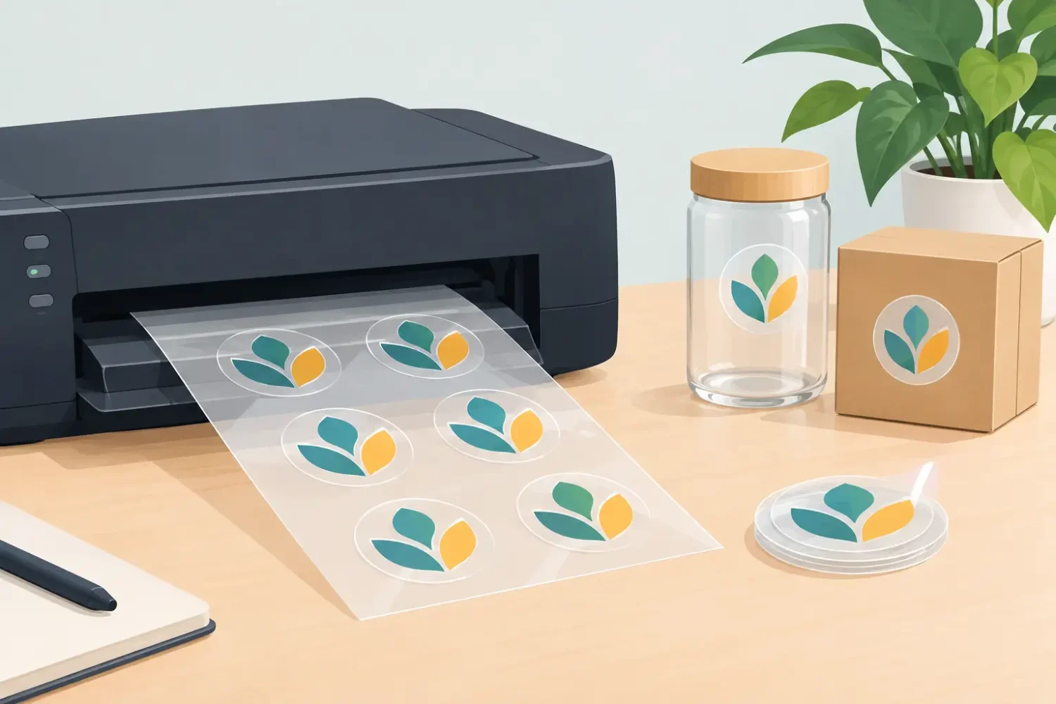
Transparent stickers look simple until they are applied to glass, clear packaging, acrylic, or colored surfaces. Then every production decision becomes visible: thin text can disappear, pale colors can lose impact, and a design meant for a white background may print far darker than expected. Knowing how to print transparent stickers starts with planning for the surface behind the sticker, not just the artwork on screen.
For business labels, retail windows, product packaging, and point-of-sale graphics, transparent material is useful when you want branding without a solid white sticker border. The result can look clean and integrated, but only when the material, ink method, artwork, and finish are specified correctly.
Choose the transparent sticker material first
Transparent stickers are commonly produced on clear polypropylene or clear vinyl film. Both provide a transparent appearance, but they suit different conditions.
Clear polypropylene is often selected for product labels, bottles, containers, and short- to medium-term indoor applications. It is thin, smooth, and gives packaging a no-label look when applied well. Clear vinyl is generally the better choice for window graphics, equipment labels, outdoor promotions, and applications needing more flexibility and weather resistance.
The adhesive also matters. A permanent adhesive suits labels that should remain in place for the product’s life or for a long campaign period. A removable adhesive is more suitable for temporary window promotions, event graphics, or retail campaigns that will change regularly. Do not choose material by appearance alone. Consider the application surface, expected handling, moisture exposure, and removal requirement before approving production.
How to print transparent stickers with readable color
The biggest challenge is that transparent film does not create a white background behind the design. Standard color inks are partly translucent. When printed directly on clear film, they take on the color of whatever sits behind them.
A yellow logo may look bright on a white carton but muted on a dark bottle. Blue type may appear acceptable on clear packaging yet become almost invisible after application to a black surface. This is not necessarily a printing defect. It is the expected behavior of ink on a transparent substrate.
For designs that need strong, consistent color, specify white ink. White ink can be printed as an underbase beneath the color artwork, giving CMYK inks an opaque foundation. This is usually the right approach for logos, product information, QR codes, fine lettering, and brand colors that must remain readable on varied surfaces.
White ink can also be printed selectively. For example, a clear window sticker may have an opaque white logo and text while leaving the rest of the material transparent. This allows the glass or packaging to remain visible around the printed elements.
There are three common white-ink approaches:
- Spot white prints only behind selected artwork, such as a logo, text, or graphic element.
- Flood white covers the full sticker area, making the final piece behave more like a white sticker with a clear outer edge.
- White-only printing creates white artwork on transparent film, commonly used for glass doors, display panels, and minimalist product labeling.
Spot white is usually the most efficient option when the transparent effect is a key part of the design. Flood white improves color consistency but reduces the visual benefit of using a clear material in the first place.
Build artwork for the final application surface
Artwork that looks correct on a white monitor background can be misleading. Design transparent sticker files with the intended application surface in mind. If the sticker will be applied to a dark bottle, tinted glass, kraft packaging, stainless steel, or a colored retail fixture, request a proof or test sample on a similar surface.
Keep small text practical. Fine type may be legible in a digital file but difficult to read once printed on clear film, especially without white backing. Bold typefaces, adequate letter spacing, and strong contrast produce more reliable results for product labels and window messages.
Use vector artwork for logos, icons, cut lines, and text wherever possible. Vector files maintain sharp edges at different sizes. Raster images should be prepared at sufficient resolution for the final print size. Low-resolution files are especially noticeable on clear film because there is no opaque background to conceal rough edges or weak detail.
If white ink is required, create a separate spot-color layer for it. Name the layer clearly according to the production workflow, such as “White Ink” or “Spot White.” The white layer should indicate exactly where the printer needs to lay down white. For a white underbase, it normally matches the color artwork. For a white-only graphic, it contains only the elements that should print in white.
Do not use a white rectangle in the artwork and assume it will print with white ink. Standard CMYK printing cannot produce opaque white. White must be specified as a dedicated ink or production layer.
Decide whether the sticker goes inside or outside the glass
Window stickers need one additional decision: viewing direction. A standard sticker is applied to the outside of the glass and viewed from the same side as the printed face. This is the usual option for storefront promotions, operating hours, decals, and event signage.
A reverse-printed sticker is applied to the inside of the glass and viewed from outside. The artwork is printed in mirror image so it reads correctly through the glass. White ink is often added behind the color layer to improve visibility and protect the printed image.
Inside-glass application protects the sticker from weather, cleaning, and casual damage. However, it depends on clean glass and can lose visual impact where reflections, tinting, or double-glazed panels interfere with the view. Outside application gives stronger visual presence and is simpler for many campaigns, but it may need a more durable material and laminate for exposed locations.
Match the print method to the job
The right print method depends on quantity, durability, detail, and placement. UV printing is a strong option for transparent stickers requiring white ink, sharp detail, and short to medium production runs. UV inks cure quickly and can produce dense white layers and precise graphic elements.
Eco-solvent and solvent printing are commonly used for durable vinyl graphics, particularly for window decals and outdoor promotional stickers. Depending on the printer setup, white ink may not be available, so confirm this before finalizing a design that depends on opacity. Latex printing can also suit durable, fast-turnaround graphics with low odor, making it practical for many retail and indoor display applications.
For high-volume product labels, other label-printing systems may be more cost-effective. The main point is to match the process to the intended result, rather than selecting a method based only on price. A low-cost clear sticker without white ink can become expensive if the branding disappears after application.
Add laminate when handling or exposure requires it
A laminate is not always necessary, but it is useful for stickers exposed to frequent handling, moisture, UV light, or abrasion. Gloss laminate can intensify color and create a polished finish. Matte laminate reduces reflections and is often easier to read under retail lighting, though it may slightly soften the transparent appearance.
For window graphics, consider the cleaning routine. Stickers placed near entrances may be wiped frequently. For product labels, consider condensation, oils, refrigeration, and friction during transport. A clear film may look premium at installation but fail early if the adhesive and protective finish do not suit real use conditions.
Prepare for cutting, application, and approval
Most transparent stickers are supplied as individual die-cut pieces, kiss-cut sheets, or larger printed decals. Die-cut stickers follow the shape of the artwork. Kiss-cut stickers remain on a backing sheet, which can make small labels easier to peel and distribute. Large window graphics may be supplied as panels with application tape.
Include a cut contour in the artwork if the sticker is not a simple rectangle. Keep important text and logo elements safely inside the cut line. Very narrow borders can look uneven after cutting, particularly on irregular shapes. For complex artwork, a slightly wider clear border is often more forgiving.
Before full production, review a proof for spelling, dimensions, cut shape, white ink placement, viewing direction, and final application surface. This approval stage is where costly mistakes are prevented. A transparent sticker succeeds when it looks intentional after installation, not only when it looks good in the artwork file.
For commercial campaigns, specify the end use from the start: clear product label, inside-glass retail decal, outdoor window promotion, equipment marking, or branded packaging seal. That one decision guides the material, adhesive, ink coverage, finish, and cut format – and gives the final sticker the clean, professional appearance transparent media is meant to deliver.
Related Posts