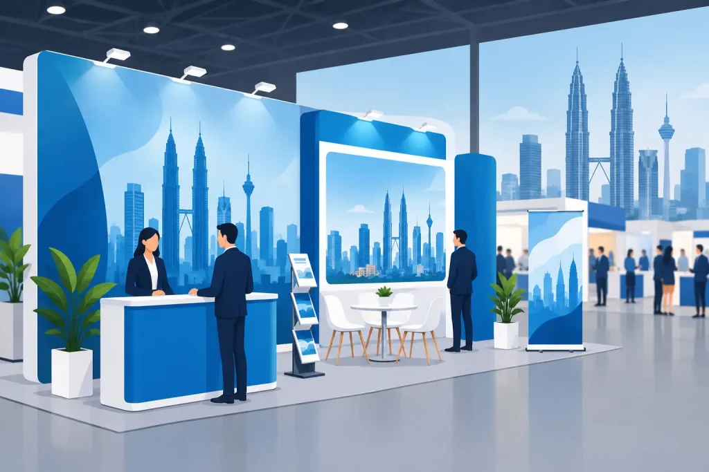
A 3 m-wide backdrop can look sharp from across an exhibition hall and still fail at the printer because the file has no bleed, the logo sits too close to a pole pocket, or the supplied image is only suitable for a brochure. To prepare artwork for large format print, the file must match the finished display size, viewing distance, material, hardware, and production method.
Large-format jobs are not all built to the same rules. A roll-up stand, PVC banner, LED light frame, wall graphic, beach flag, and popup display each need different allowances and graphic treatment. Confirm the product specification before design begins. This avoids late-stage resizing, cropped messages, or graphics that do not fit the hardware.
Start With the Finished Size and Product Template
Work from the product’s finished graphic size, not the visible area you estimate from a product photo. Display hardware often includes areas that wrap around a cassette, sit inside a frame, fold behind a panel, or disappear into a hem. A pull-up banner may need extra material at its base. A fabric backdrop may require bleed for sewing. A light frame needs graphics sized for its silicone edge or fabric tension system.
Ask for the production size, bleed requirement, safe area, and any hardware-specific template. Use the template at the start of the layout and place it on a locked layer. Do not scale a completed A4 flyer into a 33-inch roll-up banner and expect the same spacing or image quality. Rebuild the layout for the format.
Keep key content inside the safe area. This includes logos, phone numbers, QR codes, pricing, taglines, faces, and product details. Background colors and non-essential patterns can extend into the bleed area, but no critical element should depend on an edge that may be trimmed, sewn, or hidden by hardware.
Set Scale and Resolution for Large Format Artwork
Resolution is judged differently for a building banner than for a countertop display. The closer the viewer stands, the more detail the file needs. A retail window sticker or LED light frame is usually viewed at close range, while a large outdoor banner may be read from several yards away.
For most exhibition displays, retail panels, roll-up stands, and point-of-sale graphics, build raster images at 100 to 150 ppi at final output size. For very large banners intended for distance viewing, 50 to 100 ppi can be sufficient. Supplying a 72 ppi web image and enlarging it to several feet wide will not create new detail. It will only enlarge the pixels.
Full-size files are usually the simplest option for moderate display dimensions. For oversized jobs, working at half scale or one-quarter scale is practical if the scale is clearly stated and the effective resolution is increased accordingly. For example, artwork created at 50% scale should use twice the target final resolution. A 150 ppi image at half scale outputs at the equivalent of 75 ppi at full size.
Avoid adding artificial sharpening to rescue a weak image. It can create halos and rough edges, especially on faces, gradients, and product photography. If the source image is too small, choose a different image, reduce its final print size, or redesign the panel around solid color, type, and vector graphics.
Build Logos, Text, and Graphics as Vectors
Logos, icons, line art, and typography should be vector whenever possible. Vector artwork remains clean when scaled for a popup wall, directional sign, or window graphic. Use the original AI, EPS, PDF, or SVG source rather than downloading a small logo from a website.
For text, keep font sizes proportional to the viewing distance. Fine legal copy may work on a printed brochure but be unreadable on a floor stand. As a practical check, stand back from the artwork on screen or print a reduced proof. If the main message cannot be read in a few seconds, the display is doing too much.
Use strong contrast between text and its background. Light gray type over a product photo may look refined on a monitor but disappear under exhibition lighting. This matters even more for backlit graphics, where light can make pale colors appear lighter and reveal uneven density in dark areas. Add a solid panel behind important text when the background is busy.
Use CMYK and Check Brand Colors Early
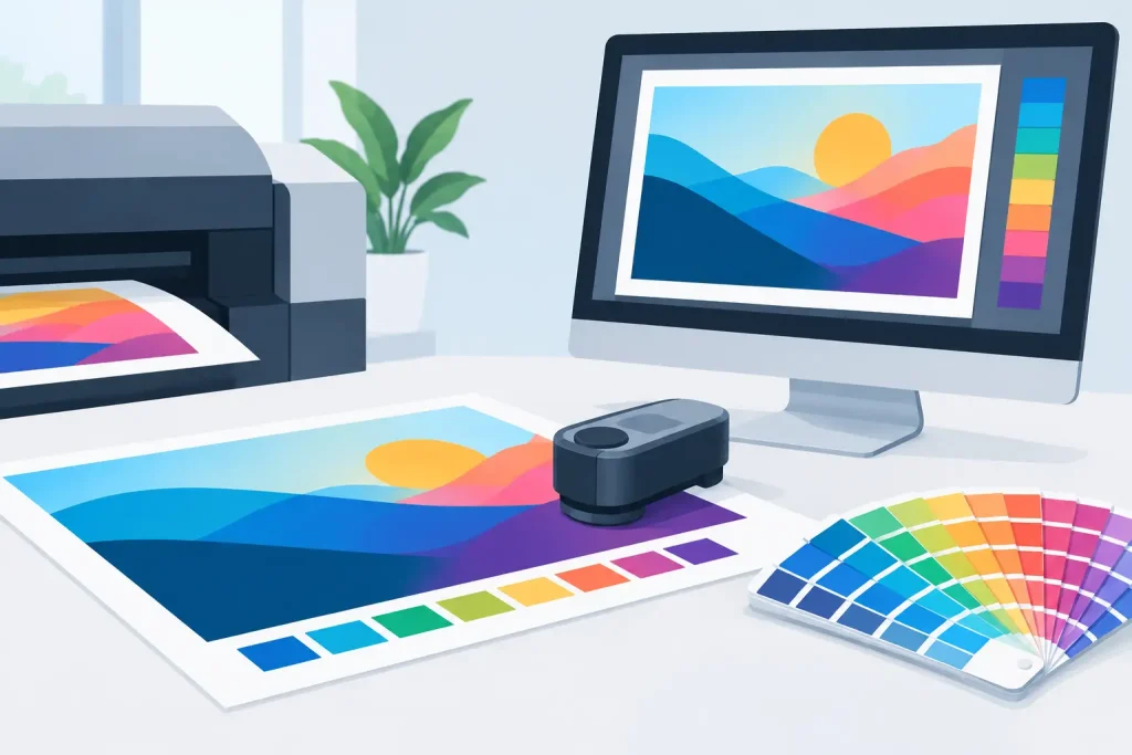
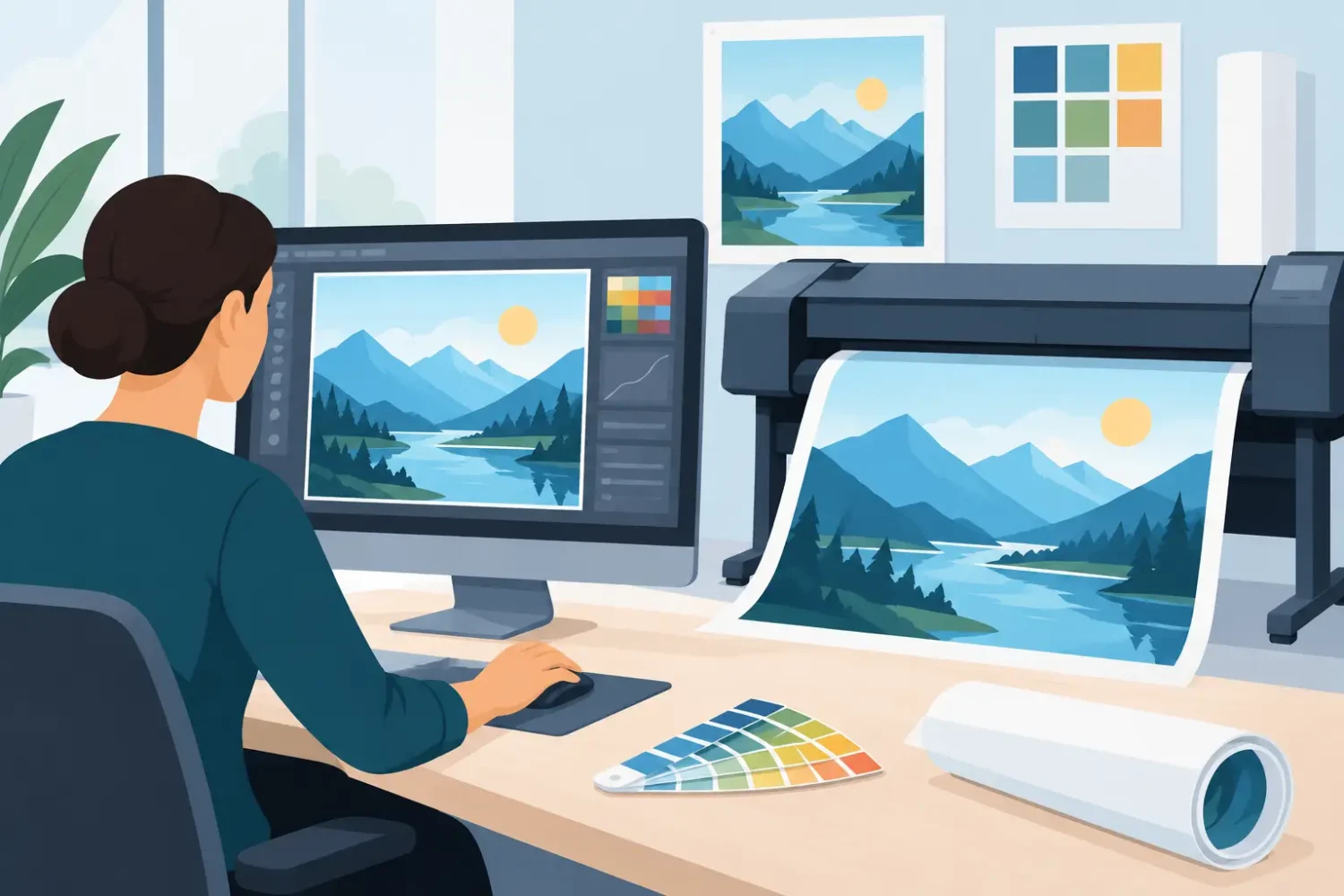
Commercial large-format printing uses CMYK process inks, with output varying by material and print method. Convert supplied RGB artwork to CMYK before final approval so you can see likely color shifts. Bright RGB blues, greens, oranges, and neon-style colors are common problem areas because they can fall outside the printable CMYK range.
Keep brand color expectations realistic. A UV print on KT board, a latex print on PVC, and dye sublimation on fabric will not always produce identical results. The substrate surface, ink system, finish, lighting, and viewing environment all affect appearance. If a corporate color is critical, provide the approved CMYK value or Pantone reference and request a proof or color test when the job size and deadline allow it.
Rich black deserves attention. For large solid black areas, a rich black build can produce deeper coverage than 100% K alone. However, the preferred mix depends on the print process and material. Use the production specification supplied for the job rather than copying a black formula from another printer or another substrate.
Add Bleed, Keep Safe Margins, and Plan Finishing
Bleed is extra image area beyond the final trim size. It gives production room for cutting variation and prevents a thin unprinted edge. The amount depends on the product. A trimmed sticker may need a small bleed, while banners with hemming, pole pockets, eyelets, or sewn edges require wider allowances.
Finishing changes usable artwork space. Before approval, account for:
- Hem and pocket depth on banners and flags
- Eyelet positions and reinforced corners
- Frame channels, silicone edges, and tension fabric borders
- Roll-up cassette insertion area and top rail coverage
- Folding panels, curved popup sections, and display stand overlap
A full-bleed background can continue through these areas. Do not place a logo, QR code, face, or product label there unless the template confirms it will remain visible. QR codes need particular care: retain a clear quiet zone around the code, use adequate contrast, and test scan it from a printed proof at realistic viewing distance.
Prepare Images for the Actual Material
The same artwork can need different treatment on different materials. Glossy sticker stock can make colors appear more saturated and reflect surrounding lights. Matte surfaces reduce glare but can soften contrast. Transparent stickers need consideration for the background they will be applied to. White ink or a white backing layer may be needed if the design contains pale colors or is installed on glass.
Backlit film and LED light-frame graphics require balanced density. Large dark areas may need adjustment so they do not look washed out once illuminated. Fabric dye sublimation can produce an attractive soft finish but may render very small type and hairline details less crisply than a rigid UV-printed board. PVC banners are durable for many outdoor and event uses, but the design still needs enough contrast to read in sun, shade, or indoor lighting.
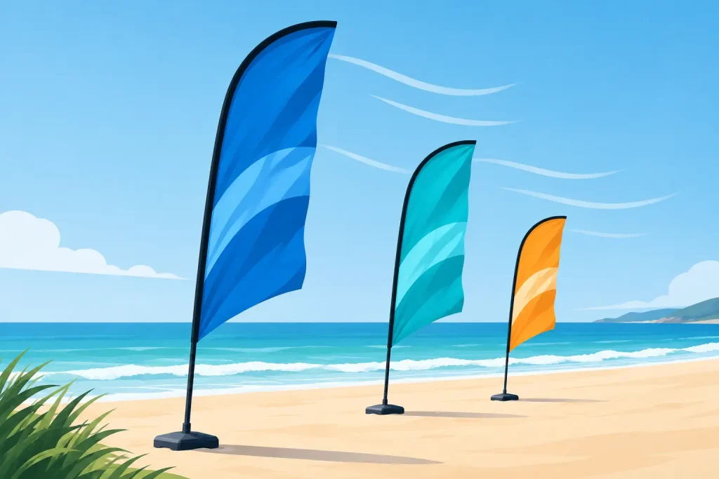
When a campaign uses several formats, do not assume one master file fits all. Keep a consistent visual system, then adapt the crop, text size, and image placement for each item. A beach flag needs a tall, vertical composition. A counter graphic needs messaging that works at close range. A 10-foot popup can support a wider visual story.
Export a Production-Ready PDF
A press-ready PDF is the most reliable delivery format for most large-format work. Export with bleed included, crop marks only when requested, and all images embedded. Preserve vectors where possible. Avoid placing linked files from a local drive unless you are packaging the full working file for production.
Before sending, inspect the PDF at 100% zoom. Check for low-resolution images, accidental white boxes, missing graphics, thin rules, spelling errors, and objects outside the intended area. Confirm that overprint settings have not been applied accidentally to white objects. Flattening transparency may be required for some workflows, but it can affect shadows and blending effects, so inspect the exported result rather than assuming it matches the design file.
Name files clearly. Include the product, finished size, artwork side, revision, and date. For example: `Brand_RollUp_33x79in_Front_Rev03.pdf`. Clear filenames prevent the wrong version from entering production when several branches of a campaign are being approved at once.
Final Check Before You Release the Artwork
Before approving print, compare the file against the order details: quantity, material, print side, finished size, finishing, hardware model, and delivery deadline. This is where a correct-looking design can still be wrong for the purchased item. A double-sided banner, a transparent sticker, and a single-sided PVC roll-up each have different production requirements.
For large campaigns, print a small-scale proof for layout and content, then review a full-size detail proof for image quality, type size, and color if practical. Marketing teams should approve the message and brand presentation; procurement or event teams should confirm fit, installation method, and venue conditions.
The best large-format artwork does not rely on last-minute fixes at the print stage. Build to the exact display format, protect the safe area, and check the exported PDF against the product specification. That gives the production team a file they can print accurately and gives your display the clear, professional result it was ordered to deliver.
Related Posts